Making Of
Making Of
Every work begins long before its first finished page.
This section documents the creative process behind eL¡jaH Revelation—from early sketches and architectural studies to character designs, page compositions, and the artistic and philosophical decisions that shape the work. It offers insight not only into how the project is created, but also into the gradual evolution of its world, visual language, and underlying ideas.
Studio Setup
Not a workspace. A space of resonance.
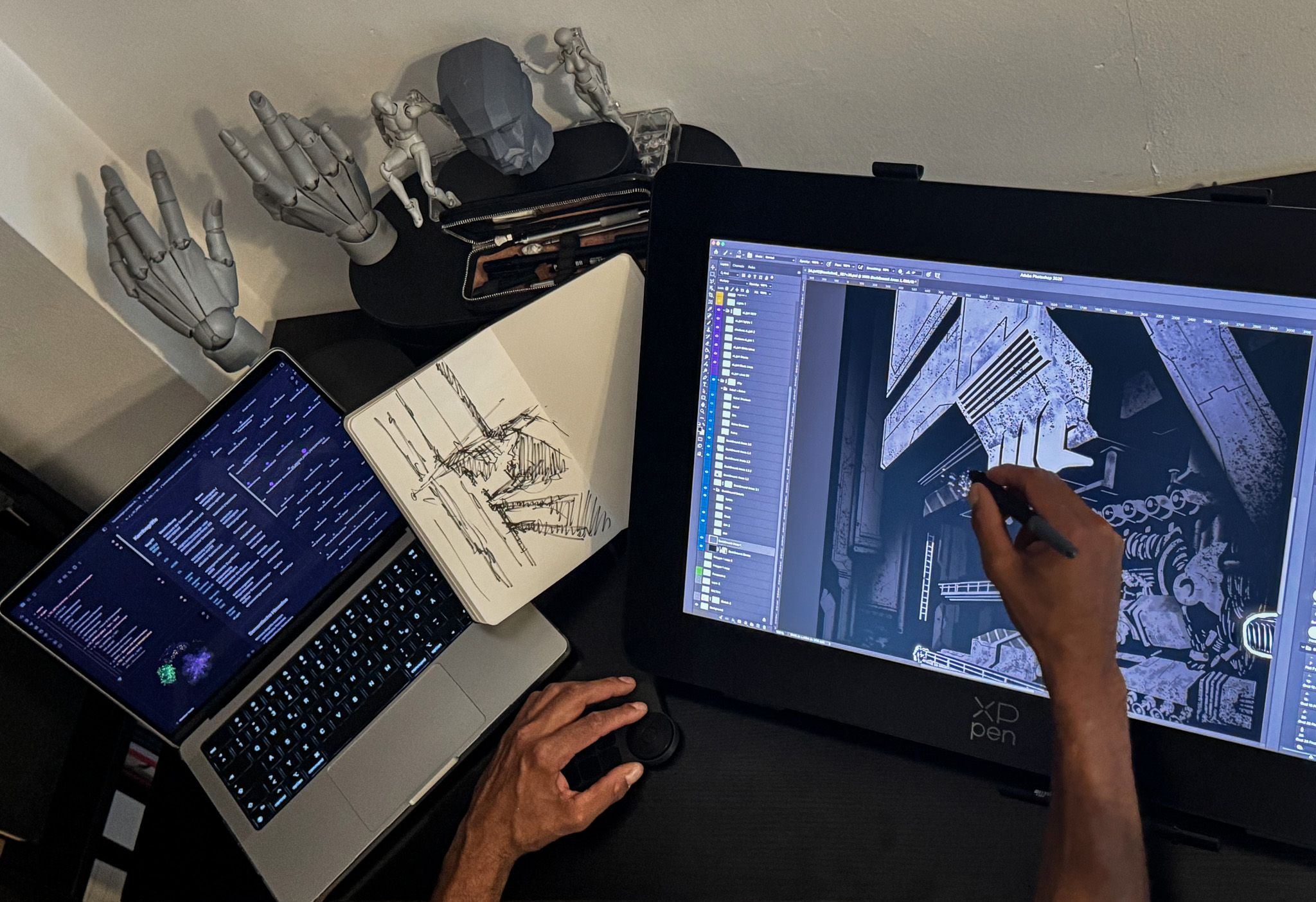
This is where the pages of eL¡jaH Revelation take shape.
The setup brings together analogue sketching and digital execution as one continuous process. While perspectives, spatial ideas, and compositions emerge in the sketchbook, the final page is developed in Adobe Photoshop on an XP-Pen Artist Pro 24 Gen 2 (4K). The MacBook Pro serves as a second space for thinking and working—providing references, structure, organization, and an overview of the project as a whole.
Artist mannequins, hand models, and study figures are not props. They are working tools used to examine form, anatomy, gesture, and spatial relationships with precision.
Every finished page is the result of countless decisions, revisions, and acts of reduction.
This setup does not document a state.
It documents a process.
—
A work is not born in a moment of inspiration.
It is created where thinking, drawing, and decision-making gradually begin to speak the same language.
— jahdara
Design Analysis
Environment Design — eL¡jaH Revelation
This analysis documents not every individual step of the process, but the key design decisions behind the final illustration.
The artwork evolves progressively from the initial spatial concept through construction, lighting, and composition to its final atmospheric execution. Each stage builds upon the previous one, examining a different aspect of the design process.
All illustrations are created entirely by hand using a graphics tablet in Adobe Photoshop. No AI-generated imagery is used.
Tools
Adobe Photoshop · Graphics Tablet
Production
100% Handcrafted · No AI-Generated Imagery
A typeface becomes an identity when its form tells the same story as its meaning.
— jahdara
From Language to Visual Identity
The eL¡jaH Revelation logotype did not begin with the intention of designing a decorative typeface. Instead, it started with a simple question: how would the title naturally appear within a Japanese context, and what kind of visual credibility could emerge from that foundation?
Rather than imitating Japanese lettering, the process began with its linguistic origin. The title was first transcribed into Katakana, the writing system used in Japanese to represent foreign names and words. Only after establishing this linguistic foundation did the actual design process begin.
Design Rather Than Imitation
The resulting transcription was never intended to become the final logo. Instead, it served as the raw material for a systematic design process. Proportions, angles, stroke weights and negative space were analysed, simplified and carefully transformed.
The goal was neither authentic Japanese typography nor a Western typeface with Japanese aesthetics.
Instead, the objective was to develop an independent visual language that respects its linguistic origin while continuing the same design principles that define every work created within jahdara.
A Constructed System
Like the signet, the logotype was not created intuitively.
Every line, angle and proportion was developed within a consistent geometric system. Form follows defined rules rather than spontaneous decisions, making the logotype part of the same architectural way of thinking that shapes the illustrations, the signet and the entire visual identity.
The result is not stylised Japanese lettering, but an independent logotype with a clear and coherent design language.